How to add, configure and customize the Divi shop module.
Divi has been designed to be WooCommerce compatible. To integrate WooCommerce you will need to install the latest version of
WooCommerce.
WooCommerce is the plugin that we recommend, as it has the nicest feature set, interface and follows the best coding practices. After you enabled the plugin, you will see a new “WooCommerce” and “Products” section has been added to your WordPress Dashboard. You can use these areas to adjust your eCommerce settings and publish new products. You can find full
documentation on WooCommerce here.
Please note that while the builder includes various WooCommerce modules, you can also use WooCommerce by itself without the builder just fine. You can create standard pages for Checkout, Shopping Cart, etc, as outlined in their documentation. You can also link straight to your woocommerce categories, or use the
WooCommerce Shortcodes within a Divi text module. This gives you the freedom to do just about anything.
VIEW A LIVE DEMO OF THIS MODULE
How To Add A Shop Module To Your Page
Before you can add a shop module to your page, you will first need to jump into the Divi Builder. Once the Divi Theme has been installed on your website, you will notice a Use Divi Builder button above the post editor every time you are building a new page. Clicking this button will enable the Divi Builder, giving you access to all of the Divi Builder’s modules. Next, click the Use Visual Builder button to launch the builder in Visual Mode. You can also click the Use Visual Builder button when browsing your website on the front end if you are logged in to your WordPress Dashboard.

Once you have entered the Visual Builder, you can click the gray plus button to add a new module to your page. New modules can only be added inside of Rows. If you are starting a new page, don’t forget to add a row to your page first. We have some great tutorials about how to use Divi’s
row and section elements.
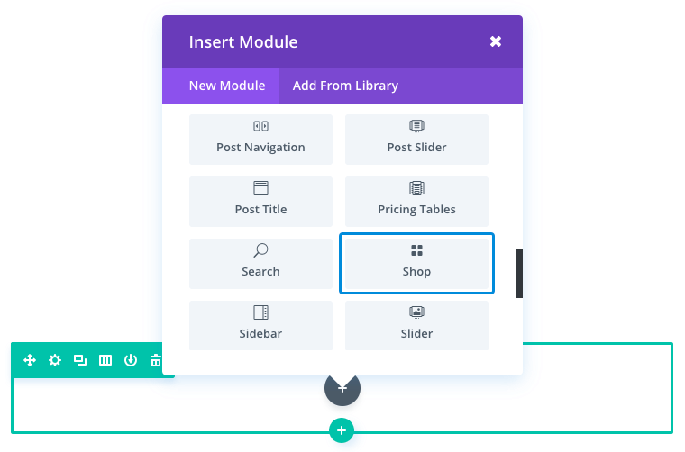
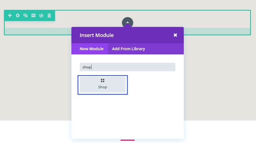
Locate the shop module within the list of modules and click it to add it to your page. The module list is searchable, which means you can also type the word “shop” and then click enter to automatically find and add the shop module! Once the module has been added, you will be greeted with the module’s list of options. These options are separated into three main groups: Content, Design and Advanced.
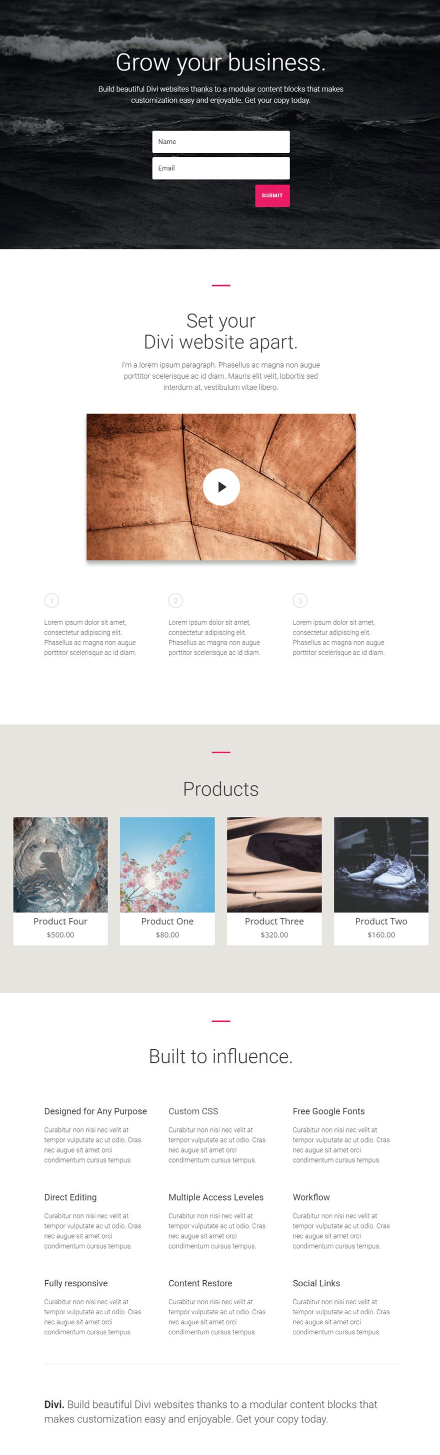
Use Case Example: Feature the Most Recent Products on a Homepage Using the Shop Module
For this example, I’m going to use the shop module to display the most recent products on a homepage.
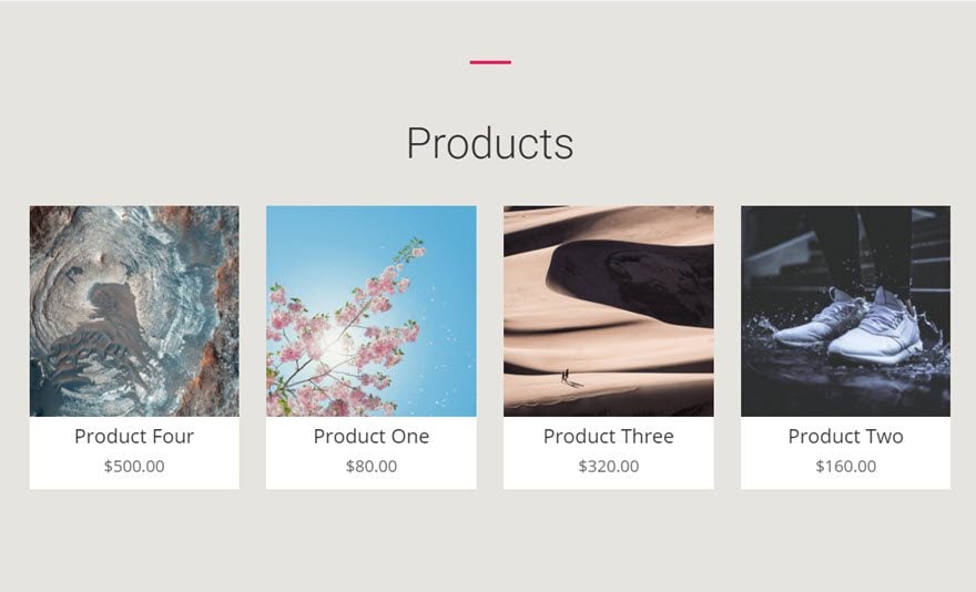
Here is the page with the four products featured.
Let’s get started.
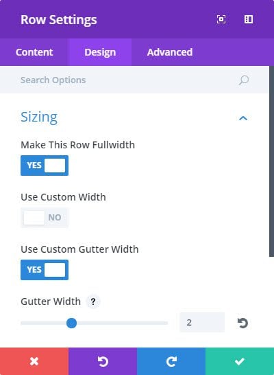
Use the visual builder to add a Regular Section with a fullwidth (1 Column) row. Change the row setting to make it fullwidth with a custom Gutter width of 2.
Then add an Audio Module to the row.
Update the Module Settings as follows:
Content Options
Type: Recent Products
Product Count: 4
Design Options
Icon Hover Color: #ea1d63
Title Font: Open Sans
Title Font Size: 24px
Price Font: Open Sans
Price Font Size: 20px
Advanced Options (Custom CSS)
Title:
text-align: center;
background: #fff;
margin-top: -10px !important;
Price:
text-align: center;
background: #fff;
padding-bottom: 15px;
That’s it! Here is the final result.
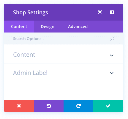
Shop Content Options
Within the content tab you will find all of the module’s content elements, such as text, images and icons. Anything that controls
what appears in your module will always be found within this tab.
Type
Choose which type of products you would like to display in your product feed. You can choose from Recent Products which will display all of your products in chronological order, Featured Products, Sale Products, Best Selling Products, or Top Rated Products.
Product Count
Define the number products that you wish to display. You will need to have products made for anything to show up inside of this module. See how to add and manage produces
here.
Include Categories
Choose which categories you would like to include.
Columns Number
Chose how many columns to display in your shop module. 4 columns should be used for a 1 column row. 3 columns should be used for a 3/4 row column. 2 column should be used for a 1/2 row column. 1 column should be used for a 1/4 row column.
Order By
Choose how you would like your products to be ordered. Choose to order by Default Sorting, Popularity, Rating, Date, Priced Low to High, Priced High to Low, Oldest To Newest, Newest To Oldest.
Admin Label
This will change the label of the module in the builder for easy identification. When using WireFrame view in the Visual Builder, these labels will appear within the module block in the Divi Builder interface.
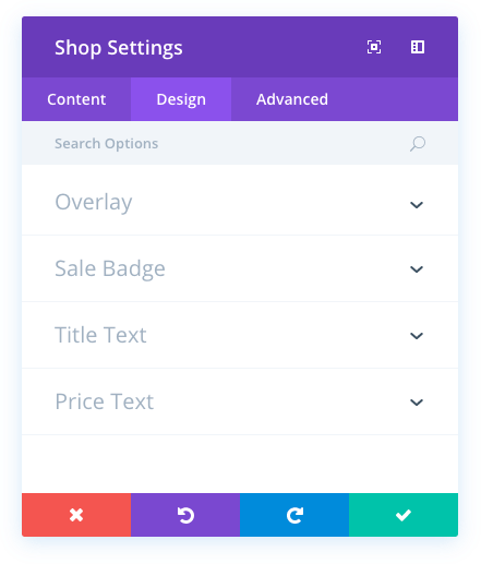
Shop Design Options
Within the design tab you will find all of the module’s styling options, such as fonts, colors, sizing and spacing. This is the tab you will use to change how your module looks. Every Divi module has a long list of design settings that you can use to change just about anything.
Icon Hover Color
When hovering over an item within the shop module, an overlay icon appears. You can adjust the color that is used for this icon using the color picker in this setting.
Hover Overlay Color
When hovering over an item within the shop module, an overlay color fades in on top of the image and below the shop’s title text and icon. By default, a semi-transparent white color is used. If you would like to use a different color, you can adjust the color using the color picker in this setting
Hover Icon Picker
Here you can choose a custom icon to be displayed when a visitor hovers over shop items within the module.
Sales Badge Color
When an item is on sale, a sales badge appears over the product image. Using this setting, you can adjust the color that is used for the badge’s background.
Title Font
You can change the font of your title text by selecting your desired font from the dropdown menu. Divi comes with dozens of great fonts powered by Google Fonts. By default, Divi uses the Open Sans font for all text on your page. You can also customize the style of your text using the bold, italic, all-caps and underline options.
Title Font Size
Here you can adjust the size of your title text. You can drag the range slider to increase or decrease the size of your text, or you can input your desired text size value directly into the input field to the right of the slider. The input fields supports different units of measurement, which means you can input “px” or “em” following your size value to change its unit type.
Title Text Color
By default, all text colors in Divi will appear as white or dark gray. If you would like to change the color of your title text, choose your desired color from the color picker using this option.
Title Letter Spacing
Letter spacing affects the space between each letter. If you would like to increase the space between each letter in your title text, use the range slider to adjust the space or input your desired spacing size into the input field to the right of the slider. The input fields supports different units of measurement, which means you can input “px” or “em” following your size value to change its unit type.
Title Line Height
Line height affects the space between each line of your title text If you would like to increase the space between each line, use the range slider to adjust the space or input your desired spacing size into the input field to the right of the slider. The input fields supports different units of measurement, which means you can input “px” or “em” following your size value to change its unit type.
Price Font
You can change the font of your price text by selecting your desired font from the dropdown menu. Divi comes with dozens of great fonts powered by Google Fonts. By default, Divi uses the Open Sans font for all text on your page. You can also customize the style of your text using the bold, italic, all-caps and underline options.
Price Font Size
Here you can adjust the size of your price text. You can drag the range slider to increase or decrease the size of your text, or you can input your desired text size value directly into the input field to the right of the slider. The input fields supports different units of measurement, which means you can input “px” or “em” following your size value to change its unit type.
Price Text Color
By default, all text colors in Divi will appear as white or dark gray. If you would like to change the color of your price text, choose your desired color from the color picker using this option.
Price Letter Spacing
Letter spacing affects the space between each letter. If you would like to increase the space between each letter in your price text, use the range slider to adjust the space or input your desired spacing size into the input field to the right of the slider. The input fields supports different units of measurement, which means you can input “px” or “em” following your size value to change its unit type.
Price Line Height
Line height affects the space between each line of your price text If you would like to increase the space between each line, use the range slider to adjust the space or input your desired spacing size into the input field to the right of the slider. The input fields supports different units of measurement, which means you can input “px” or “em” following your size value to change its unit type.
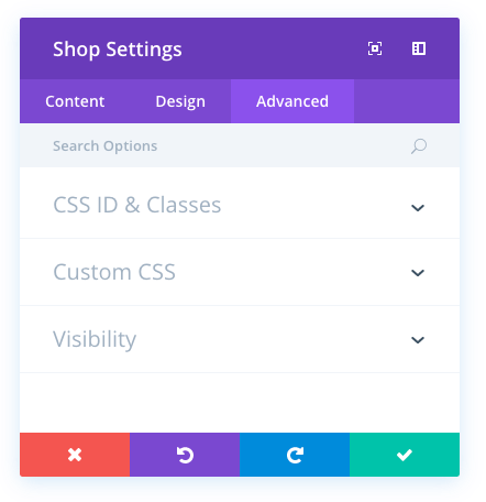
Shop Advanced Options
Within the advanced tab, you will find options that more experienced web designers might find useful, such as custom CSS and HTML attributes. Here you can apply custom CSS to any of the module’s many elements. You can also apply custom CSS classes and IDs to the module, which can be used to customize the module within your child theme’s style.css file.
CSS ID
Enter an optional CSS ID to be used for this module. An ID can be used to create custom CSS styling, or to create links to particular sections of your page.
CSS Class
Enter optional CSS classes to be used for this module. A CSS class can be used to create custom CSS styling. You can add multiple classes, separated with a space. These classes can be used in your Divi Child Theme or within the Custom CSS that you add to your page or your website using the
Divi Theme Options or Divi Builder Page Settings.
Custom CSS
Custom CSS can also be applied to the module and any of the module’s internal elements. Within the Custom CSS section, you will find a text field where you can add custom CSS directly to each element. CSS input into these settings are already wrapped within style tags, so you need only enter CSS rules separated by semicolons.
Visibility
This option lets you control which devices your module appears on. You can choose to disable your module on tablets, smart phones or desktop computers individually. This is useful if you want to use different modules on different devices, or if you want to simplify the mobile design by eliminating certain elements from the page.